Student Film Logo
Cadency
THE ASK: Design a timeless, collegiate logo that will serve as the foundation for all marketing and promotional materials including the movie poster, invites, merch, social templates, and web elements.
THE PROCESS: The brief I was given described the film as a comedy movie about higher education and the film industry and wanted a clean, elevated logo that represented a classic, collegiate design.
I took inspiration from comedic movies like Old School, Accepted, and 21 Jump Street, which all have sleek logos that are easy communicated across collateral while hinting at the academia theme. I merged the two themes of “higher education” and “film” while trying out different types of fonts, icons, and formats. To the right are some of my first draft ideas that I presented to my classmates on which to receive feedback.
1st Drafts

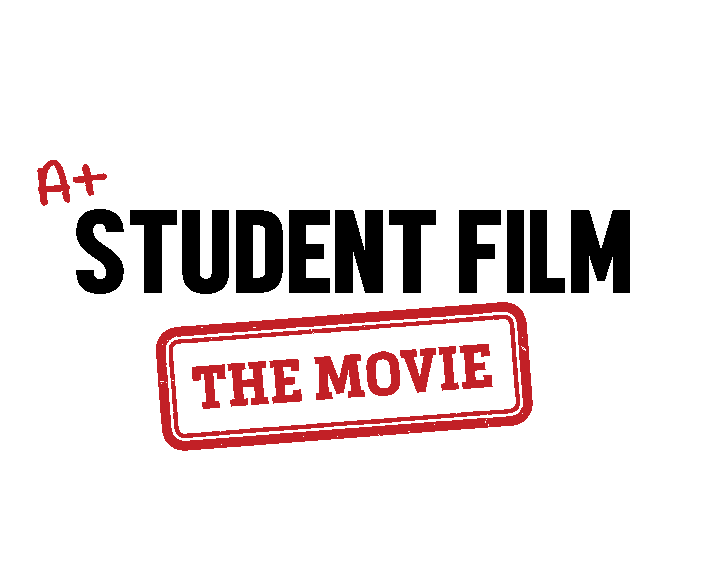
After further brainstorming, I ended up coming up with some new ideas that received a lot of positive feedback. The first logo to the left has a very simple font with elements that give it an academic vibe, and I thought that it had great potential to be animated, possibly with a stamp marking “THE MOVIE” or a pen writing the A+.
For the second logo, I got a lot of comments about the graduation cap I added so I kept that element, and I had the idea of using a film reel to replace the “I” in film and movie. These were two logos that I felt very confident about and got me into the last round of candidates.
2nd Drafts
THE FINAL: The director and producer of the movie ended up really liking the idea of using a film reel as the “O” in “MOVIE” as well my idea of using a graduation cap. I added a tassel to the grad cap so that if they animated it the tassel could swing around. At the final stage I messed around with colors and used the green and yellow that are the school’s colors in the movie.
Getting to this stage was very challenging and time consuming because the director and producer gave a lot of feedback on what they liked and didn’t like about my logos and wanted to see a bunch of different variations. My design ultimately ended up getting second place in the competition, and while I was disappointed it was not chosen, I still was very happy with the outcome of my design.
This process taught me a lot about receiving feedback and pivoting directions in the design process. The director and producer had a very specific image in mind for the logo of their movie, so it was a great opportunity to bring others’ visions to life. In the classroom, you don’t get much exposure to client collaboration and feedback, so this was a great learning process.
Final